Edit a chart

Before you edit a chart, make sure that you are editing the page on which the chart gadget appears. For more information, see the Edit a page help topic.

Then, to edit the chart, click its menu button , and choose Edit from the list of commands that appears.

The site opens the Dataset Browser interface:

  • To add a dataset to the chart, switch to the Dataset Selection tab, and click the Browse Datasets button. For more information, see the Display data from multiple datasets in a chart or table help topic.
  • To change the selection of elements from the dataset or the location of the data dimensions, switch to the Dimension Filter tab. For more information, see the Browse data help topic.
  • To change the appearance of the chart, switch to the Appearance tab. For more information, see the sections that follow.

When you are finished editing the chart, click the Save button at the bottom of the page. You should also save the page that contains the chart gadget by clicking the Save link in the toolbar.

Change the appearance of the chart

The controls under the Appearance tab enable you change the appearance of the chart in a variety of ways.

NOTE Depending on the type of chart, certain controls might not be available to you.

Theme

The Theme control provides a number of preset color schemes. Select a color scheme from the Themes drop-down menu to apply this theme to your chart.

Precision

The Precision control determines how many decimal places appear in the chart labels. To set this control, make sure that you have checked the Display option for the Labels control, and then choose a value from the Precision drop-down menu.

Chart

The Chart control enables you to set the chart type. There are six types in all: line, spline, bar, column, area, and pie.

Line chart

The line chart represents data series with straight line segments.

Spline chart

The spline chart represents data series with smoothed line segments.

Column chart

The column chart represents data series with vertical columns.

Bar chart

The bar chart represents data series with horizontal bars.

Area chart

The area chart represents data series as overlapping areas.

Pie chart

The pie chart represents data series as sections of a circle.

Stacking

The Stacking control determines how the site displays multiple data series for a single data point. To use this control, choose an option from the Stacking drop-down menu. Charts of the column or bar type make the best use of this control.

None

Choose None to turn stacking off.

Value

Choose Value to stack the series according to their values.

Percentage

Choose Percentage to stack the series according to the percent share of each.

Legend

The Legend control determines the position of the chart's legend, or the key that indicates which color represents which data series. To use this control, choose an option from the Legend drop-down menu. Choose None to remove the legend from the chart.

Gridlines

The Gridlines control places horizontal or vertical lines against the background of the chart. Check the Horizontal or Vertical options next to Gridlines to show the corresponding gridline on the chart.

Highlight

The Highlight control adds a highlighted region to the chart. The highlight can indicate periods of economic recession in the United States or the range of forecasted data. To use this control, choose an option from the Highlight drop-down menu. Choose None to turn the highlight off.

TIP To set the color of the highlight, click the color swatch to the right of the Highlight drop-down menu, and pick a new color from the palette that appears.

U.S. recession data

Choose U.S. Recession Data to highlight periods of economic recession in the United States.

Forecasted data (band)

Choose Forecasted Data: Band to highlight the region of forecasted data.

Forecasted data (line)

Choose Forecasted Data: Line to include a line in the chart that separates reported data from forecasted data.

Labels

The Labels control displays the value of each data point in the series. To use this control, check the Display checkbox to the right of Labels.

When you select the pie chart from the Chart drop-down menu, an additional drop-down menu of label options appears:

  • To display the name of each data series, choose Names.
  • To display the name of each data series with its value as a percentage of the whole, choose Names With Share (%).
  • To display the name of each data series with its value, choose Names With Value.

Axis

The Axis controls determine the placement and format of the value axis:

  • To change the positions of the value and category axes, check the Swap option to the right of Axis.
  • To remove the unit of measure from the label of the value axis, check the Ignore Unit option to the right of Axis.

Sort options

The sort options determine how the data series in the chart are sorted. To set the sort options, follow these steps:

  1. Click the Sort Options button. The Sort Options dialog box appears.
  2. From the Select Discriminator drop-down menu, choose the data series by which you wish to sort the chart. These data series appear on the chart's category axis.
  3. From the Choose Order drop-down menu, choose Desc to sort in descending order or Asc to sort in ascending order.
  4. From the Top drop-down menu, choose a value to limit the chart to this many data series per data point. For example, choose 3 from this drop-down menu to display only the top three series per point.
  5. Click OK. The Sort Options dialog box closes, and the site sorts your chart accordingly.

TIP Click the Clear Sort button in the Sort Options dialog box to revert the chart to default sorting.

Footnote

A footnote is a short piece of text at the bottom of the chart. To add, edit, or remove a footnote, follow these steps:

  1. Click the Footnote button. The Footnote dialog box appears.
  2. To remove an existing footnote, select the Not Displayed option.
  3. To display a link to the data source that you used for the chart, select the Auto option.
  4. To display your own text, select the Custom option, and type the text for the footnote in the corresponding field.
  5. Click OK. The Footnote dialog box closes, and the site updates the footnote on your chart.

Series options

Knoema enables you to set various display options for individual data series. These options are distinct from the global options, or the options that apply to the chart as a whole. Use this feature to call out particular data series for special emphasis.

To set options for a data series, click the series in the chart. The controls on the left side of the browser window now apply to the selected data series only.

Use the controls as follows:

  • To change the name of the series as it appears in the legend, type a new name in the Name field, and click Set.
  • To change the type of the series, choose an option from the Type drop-down menu. Depending on the chart type, not all series types are available in this menu.
  • To change the color of the series, click the color swatch next to Color, and choose a new color swatch from the palette that appears.
  • To change the shape of the point markers on the series, choose an option from the Marker drop-down menu. Choose None if you do not want to display markers on the series.
  • To change the axis on which the chart measures the series, choose Primary or Secondary from the Axis drop-down menu. Choosing Secondary causes the site to add an additional value axis to the chart.
  • To show or hide labels on the series, check or uncheck the Display checkbox to the right of Labels.

To return to the options for the chart as a whole, click the Global Options button.

Change the chart title

To change the chart title, click the Edit button 
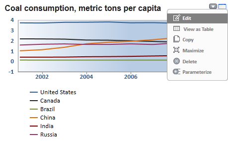
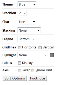
to the right of the current title.

Type the new title in place of the old one, and then click the Save button to save your changes, or click the Cancel button to revert to the original title.

Return to Knoema help